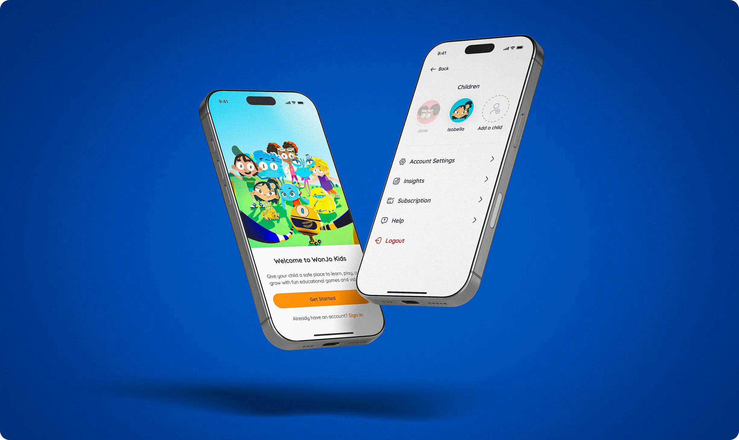
The product needed to serve two very different audiences. Children needed an experience that felt playful, visual and easy to navigate, while parents needed clear controls for accounts, subscriptions and progress.
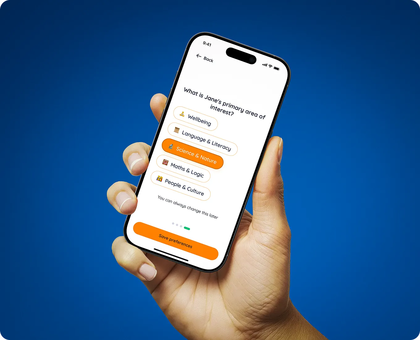
We designed separate flows for each audience while keeping the overall product connected. Parent access, child profiles and onboarding were structured to stay simple without making the experience feel overly complex.
The interface was designed to remain approachable across different ages and screen sizes, from phones to tablets.
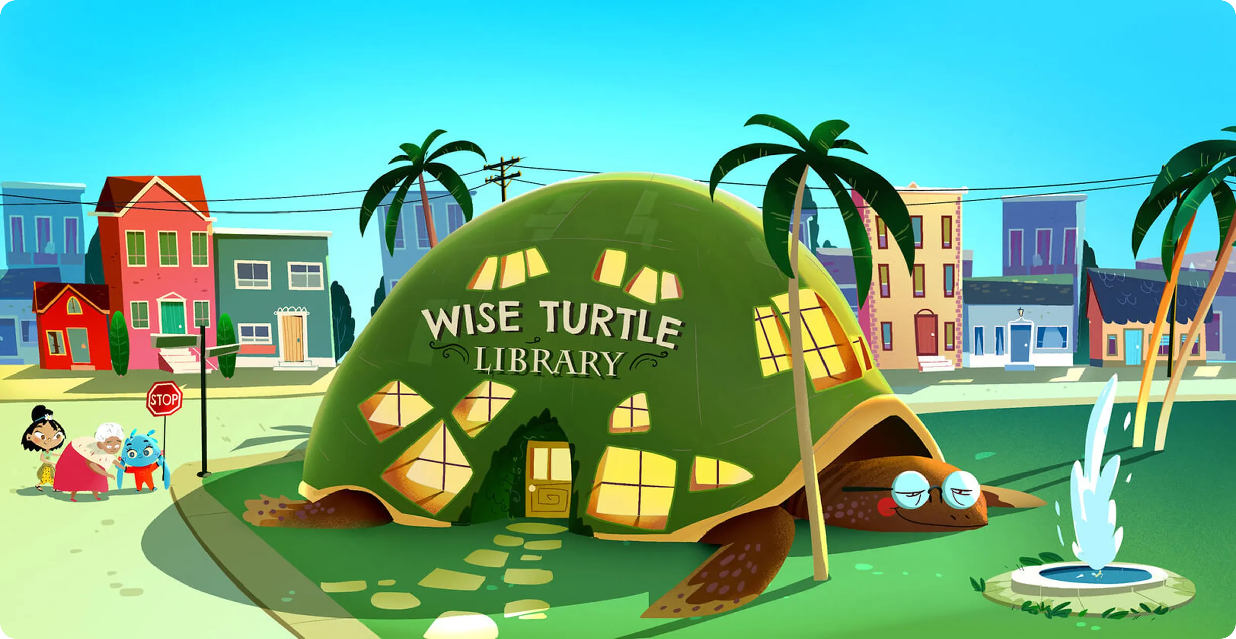

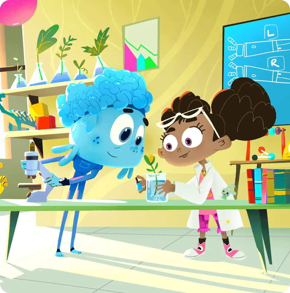
The children's experience brings together games, videos and learning activities in a visual environment built around discovery.
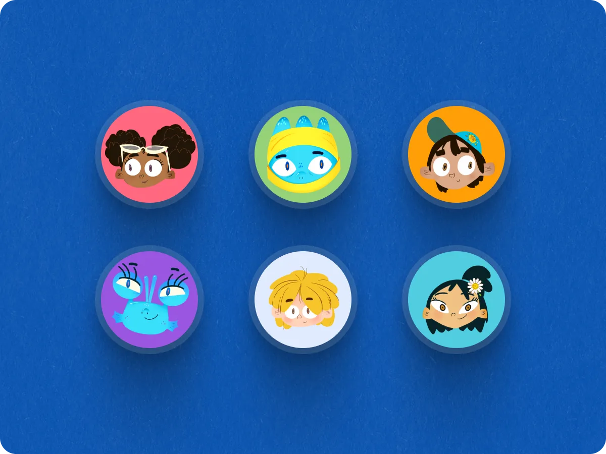
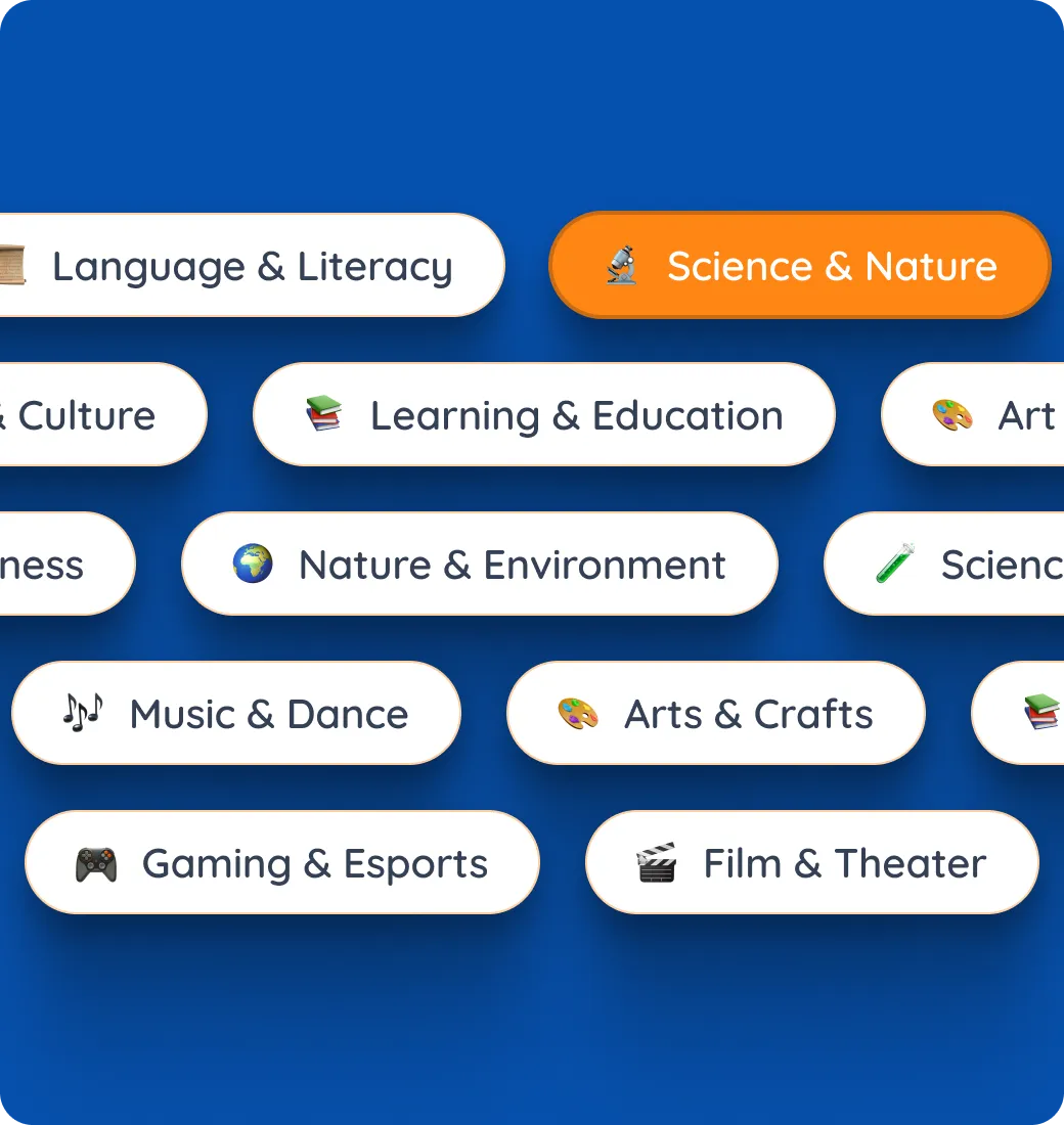
Content was organized to make activities easy to browse, while interests, avatars and categories helped personalize the experience for each child.
The goal was to keep learning structured without making the product feel like a traditional school interface.

Parents needed a clear way to understand how their children were using the platform and progressing through learning content.
We designed dashboards for learning activity, achievements and progress, along with profile management and subscription flows.
A shared design system supported both the parent and child experiences, creating consistency across the product while allowing each side to retain its own tone and interaction patterns.