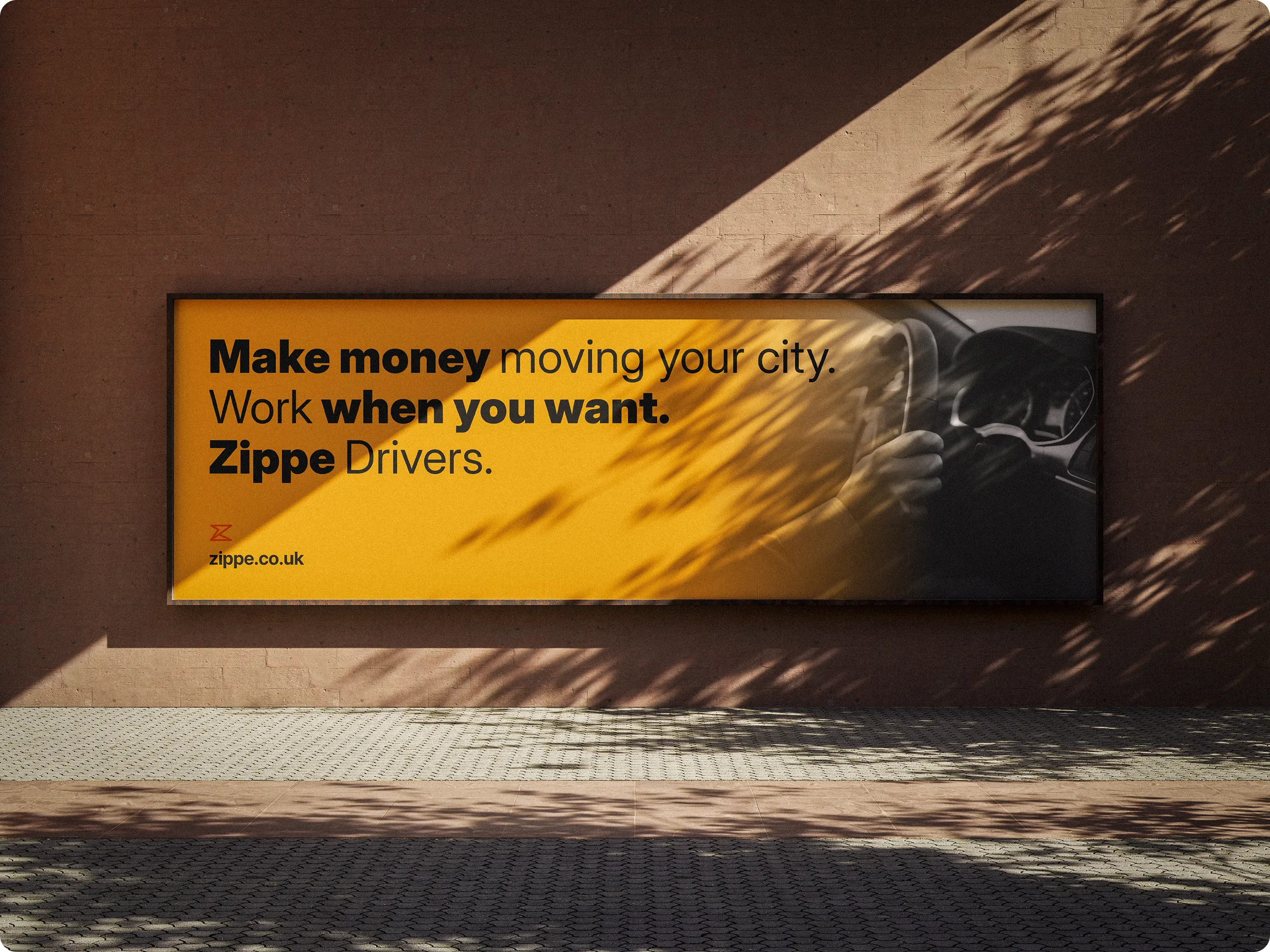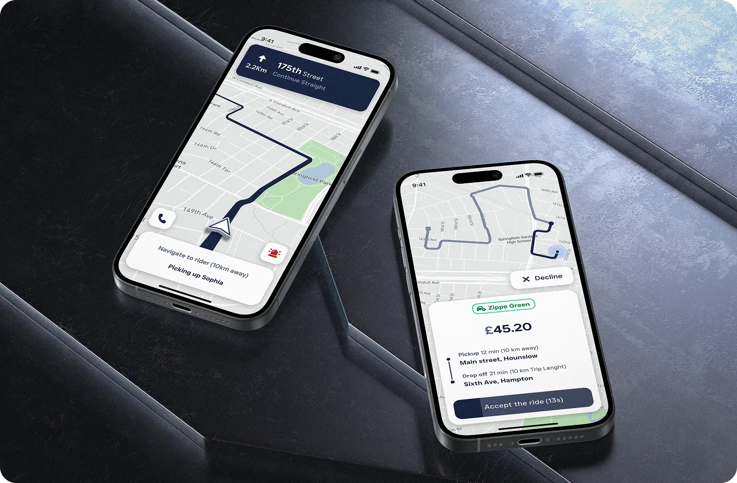
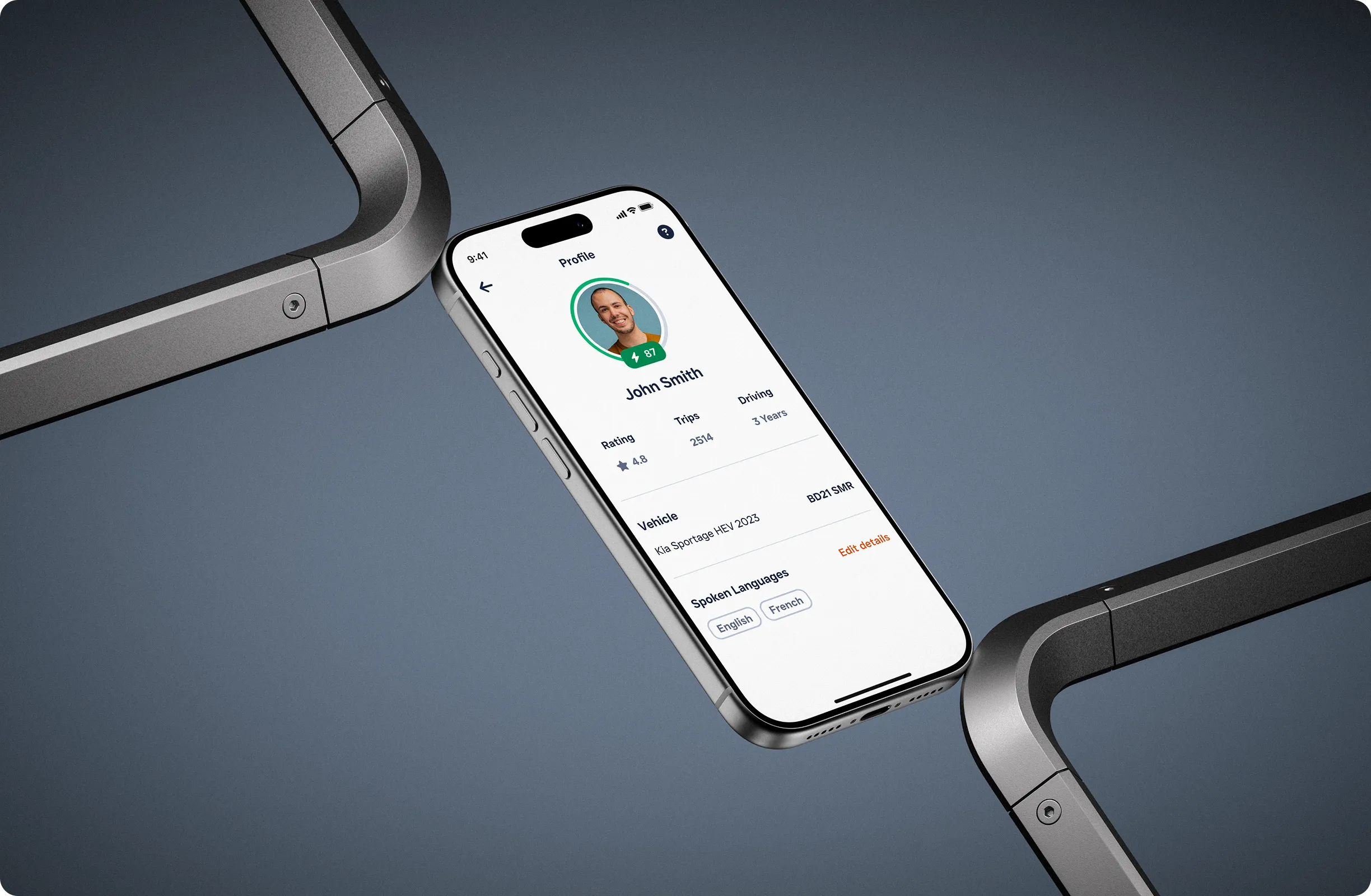
The product needed two connected experiences: one for passengers booking and managing rides, and another for drivers receiving requests, navigating and managing their work.
We designed both apps around the same underlying journey while giving each side the information and controls they needed at every stage.
The goal was to make booking, accepting and completing a ride feel predictable, fast and easy to understand.
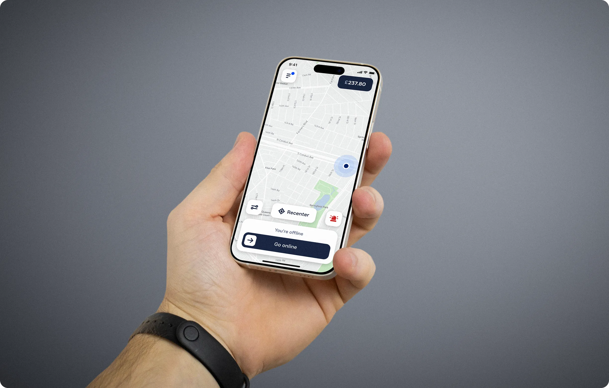
Ride-hailing depends on users making quick decisions while locations, routes and ride states continuously change. Clear hierarchy and immediate feedback were therefore central to the experience.
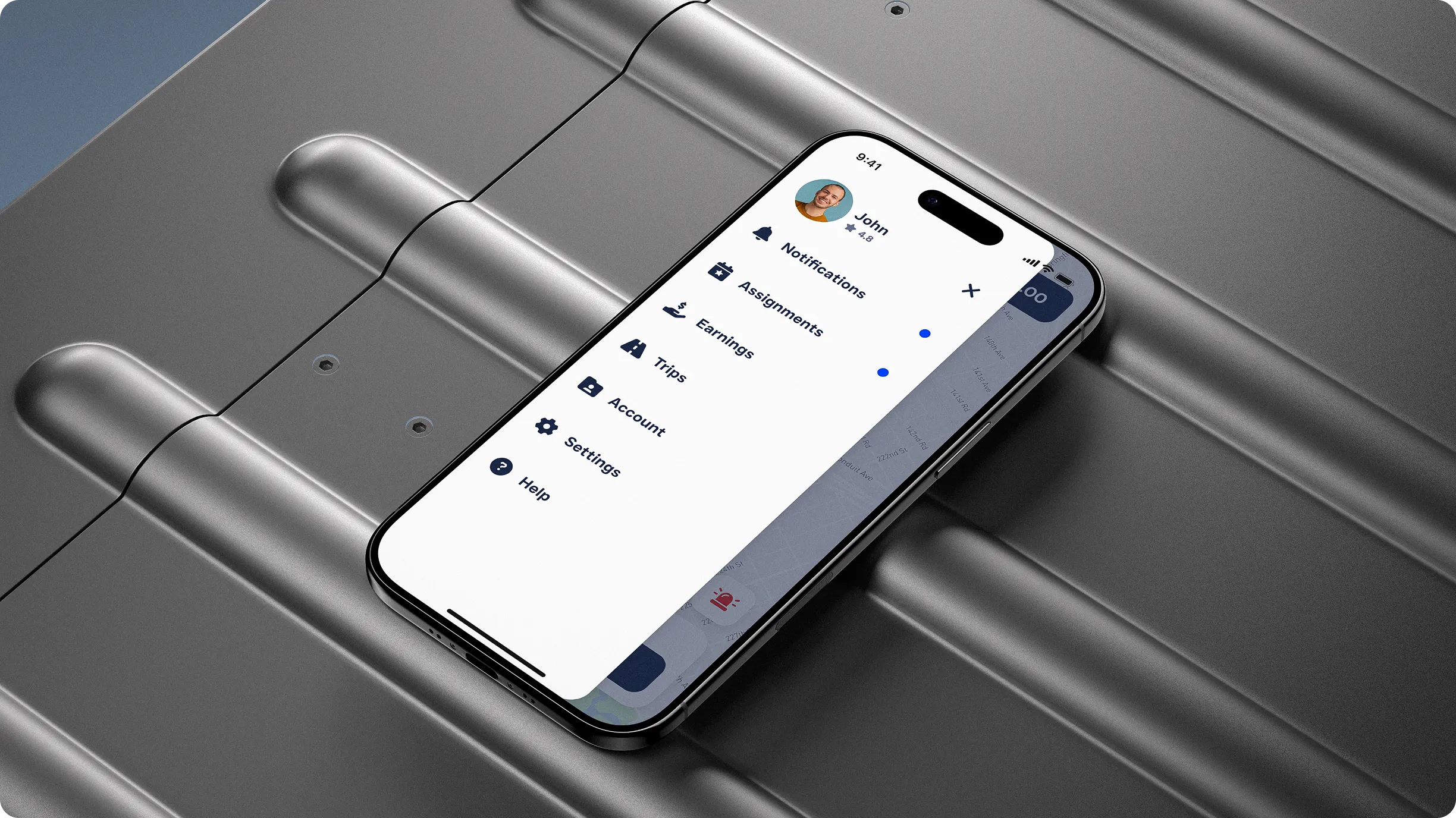
Driver flows were designed around incoming requests, pickup information, navigation and ride status, while passenger flows focused on booking, tracking, payments and trip progress.
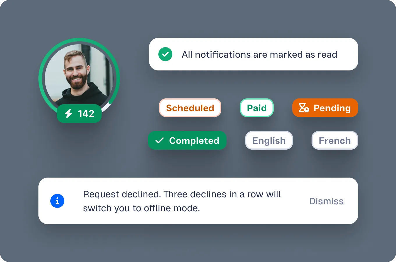
Important states such as declining requests, going online or offline, safety actions and notifications were designed to remain visible without distracting from the primary task.

A shared design system was created alongside the product so both apps could feel like parts of the same Zippe experience while supporting very different user needs.
Reusable components, states and interaction patterns helped maintain consistency across maps, ride cards, navigation, payments, status indicators and feedback.
The system gave the product a scalable foundation that could grow across both the passenger and driver experiences without redesigning common patterns from scratch.